Structure and Format
The foundation of a resume is important in that it holds the document together. Both the structure and format act as the framework of a resume and, when set up properly, presents the candidate in an impressive and professional manner. This is what we try to accomplish.
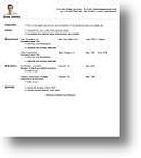
- All of your contact information is displayed at the top of the page, your name is bold or uses a larger font, and the other contact information should be easy to read. This section should be placed above in the top header.
- Try not to exceed one page in length if you can manage it.
- All formatting (bullets, bold text, italics, font sizes, typeface, and spacing) should be consistent and neat throughout the entire page.
- All tenses (verbs and action verbs) are supposed to be in the present tense for jobs/positions in which you currently hold; past tense is used for a position that you no longer occupy.
- Use two to five statements in bullet format under each section where you have lists.
- The order of the sections should be logical and neat, read about the different resume types for appropriate section placement.
Although the content of your resume is what is most important, no employer is going to take their time to read about your accomplishments if their appearance is sloppy or simply incorrect. Take a moment to be sure that the appearance of your document is in check with the items on this list.
- There are one-inch margins located on all four sides of the page.
- Black ink is the preferred color with an appropriate font. The font size is to be neither too large, nor too small and the entire page should be easy to read.
- A logo or photo can be added to increase the level at which the document is aesthetically pleasing and interesting.
The contents of your resume display who you are and what you have done in your professional career. The sections that contain your career content are, by far, the most important when it comes to job applications, so make sure that you follow all these guidelines and get noticed for your outstanding experience.
- Your content section should include the following headings: Skills, Education, and Experience.
- The Employment section may include no more than five jobs, choose your most relevant jobs without letting any employment gaps show up.
- The Education section should, again, include no more than five institutions, avoid entering high school information if you have achieved a higher level of learning.
- The Skills section should list any certifications, internships, volunteer work, or apprenticeships that you may have. Be descriptive and write about any equipment or languages with which you are proficient. In the Skills section you can go into more detail, for assistance with creating your Skills section see our tutorial on writing about your skills.
- All statements made as descriptions should include the following. Begin with an action verb, then briefly depict how your skills and accomplishments have enabled you to do an excellent job. Also, quantify your strengths by using an actual numerical value in your statements such as, increased sales 40% in the third quarter. Don't forget to use keywords in your writing.
With such strict guidelines to follow it can take some creativity to fine-tune your resume so it differs from the rest of the competition. However, by going the extra mile and including some of these features in your documents, your portfolio can become a beacon to recruiters to help you get an interview.
- Proofread the entire document looking for spelling errors and grammatical errors. Our spell-check feature can aid in this task.
- Incorporate the use of action verbs any chance that you have. This will make your writing more targeted and effective.
- Include the skills that employers are searching for: communication, team-building, incredible work ethic, and passion for the field.
- Don't forget about any awards you have received. Place them with your experience or separately in one of the Additions sections.
 Compiling a resume is time-consuming and oftentimes you may have forgotten to include a major component accidentally in the midst of your mad dash to get it finished.
Well, never fear because you can use these resume checklists. You can be certain that your portfolio will contain all the essential content and necessary formatting that recruiters are accustomed to seeing.